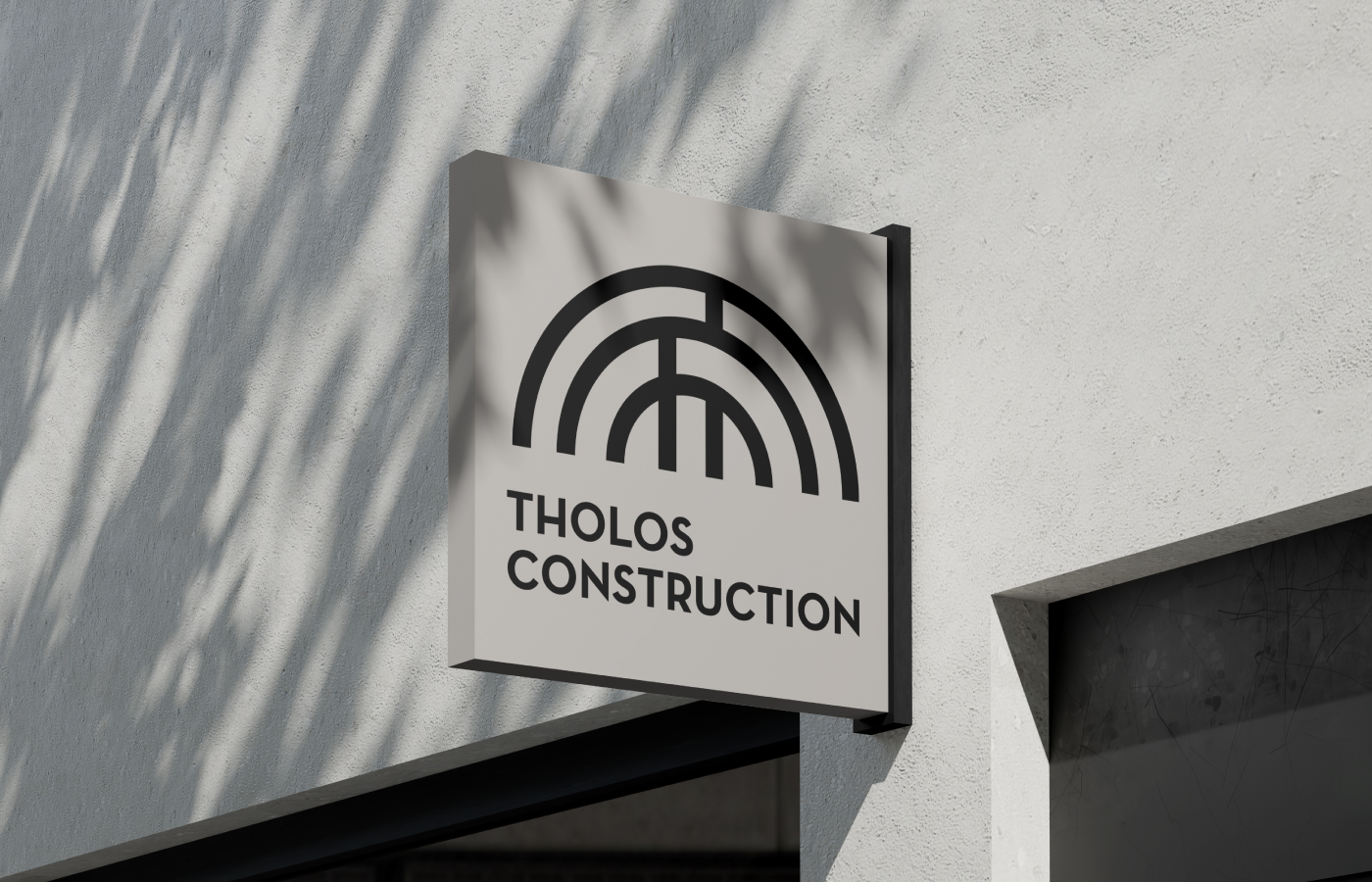
Tholos Construction is a family-run firm with a long-standing presence in the construction industry, known for its precision, integrity, and strong architectural foundations. The recent addition of Interior Design services marked a natural evolution – prompting a refined visual identity that reflects a more holistic design approach while preserving the brand’s legacy.
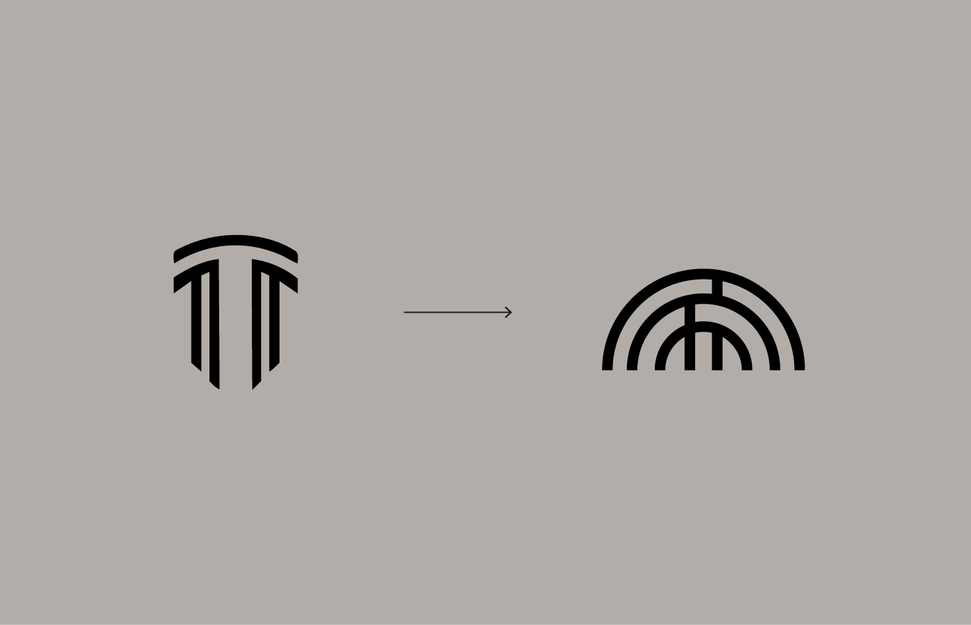
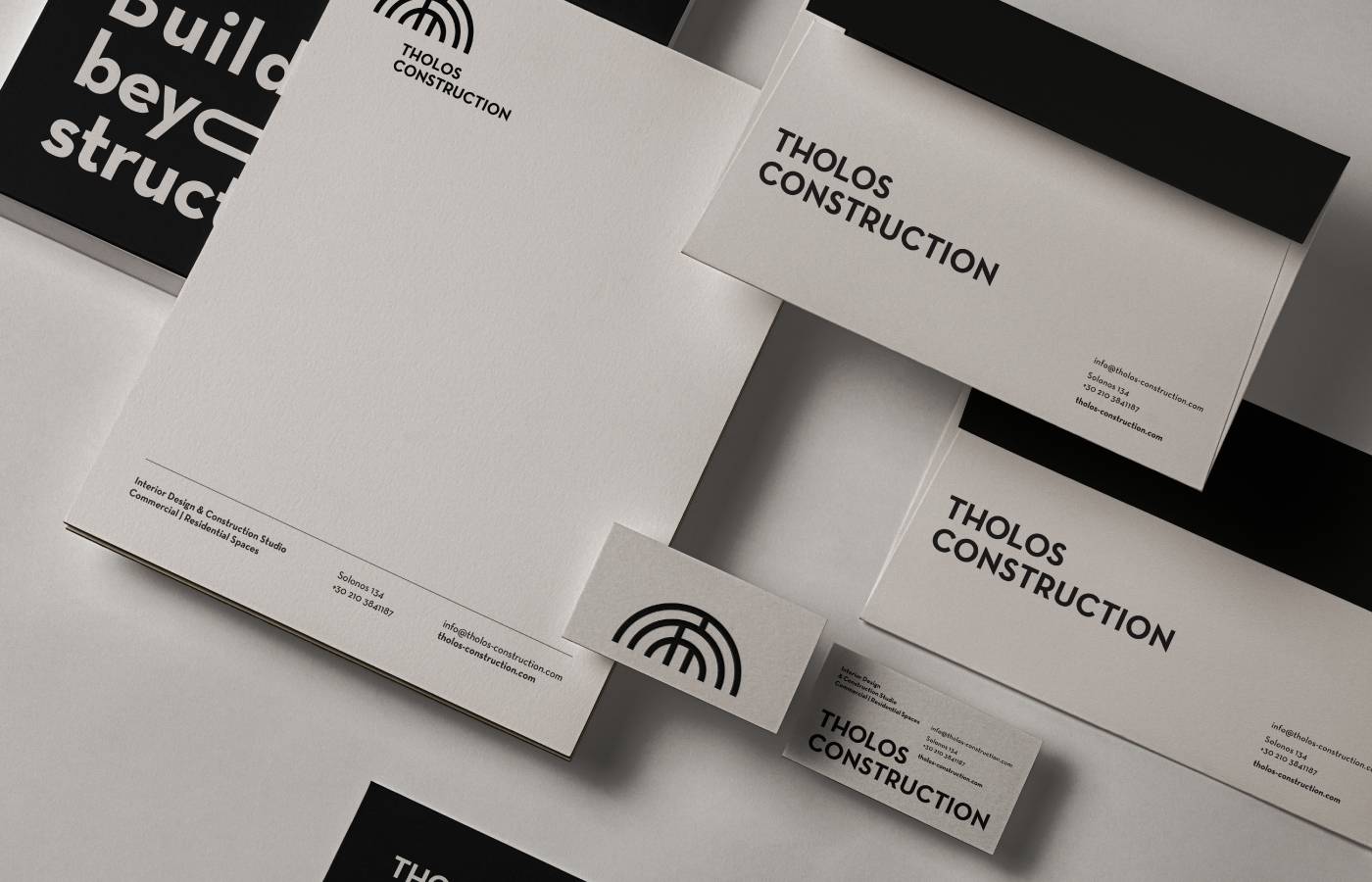
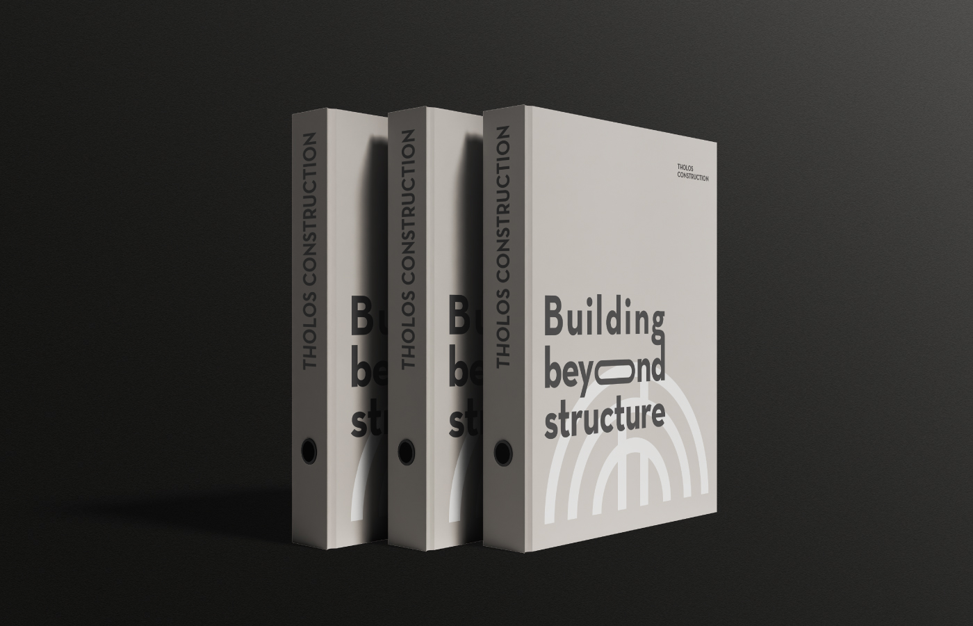
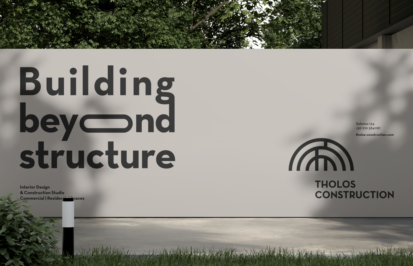
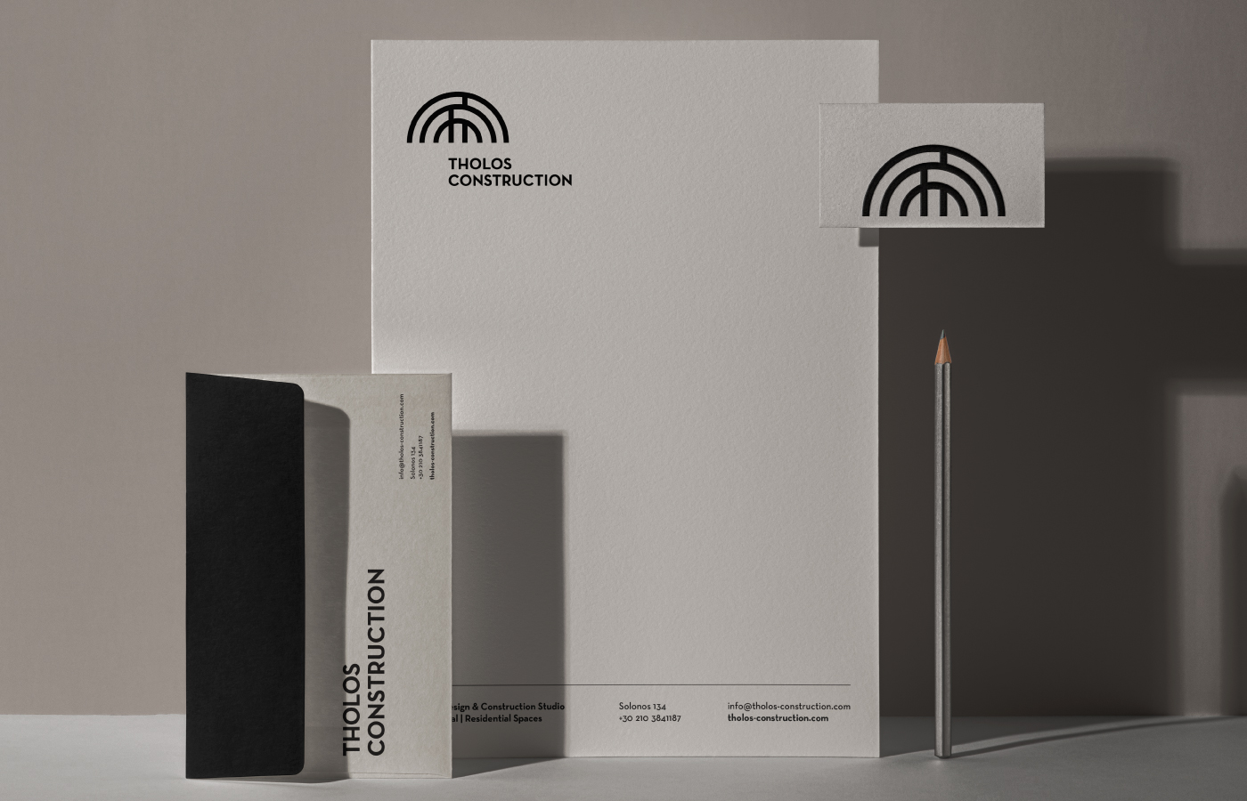
The original logo featured a sectional view of a dome, forming the letter T : a reference to both the company name and classical architecture. In the updated identity, the dome is completed, transforming the mark into a full, balanced form. This subtle shift symbolises a transition from structure to totality, from construction to complete spatial experience. The colour palette remains grounded in earthy greys and deep black, conveying strength and quiet confidence.
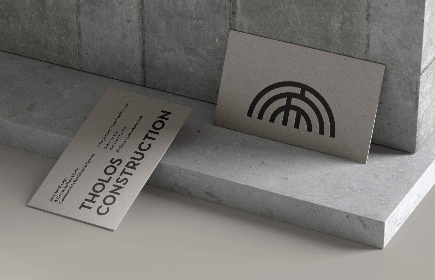
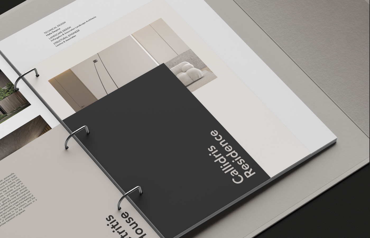
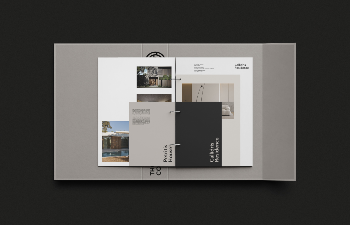
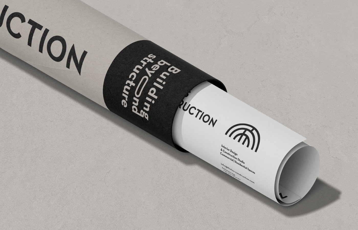
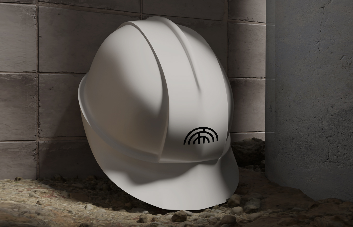
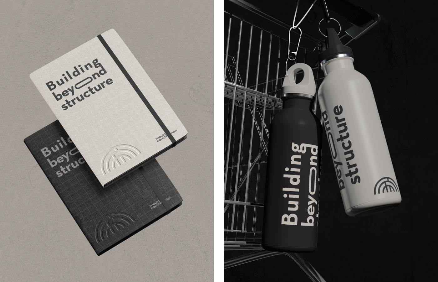
The result is a logo that feels both architectural and timeless, supporting the brand’s expansion without losing its essence. Clean, minimal applications across print and digital ensure the identity speaks with clarity and purpose, rooted in structure, refined in detail.
INSPIRATIONAL CHANNEL
Classical geometry. The quiet strength of architectural form
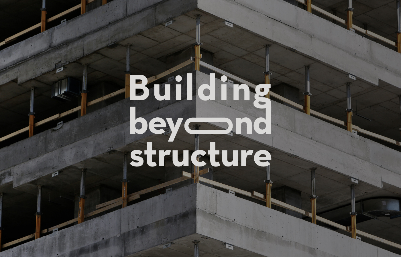
WE ACCEPT THE CHALLENGE
To evolve a legacy of construction into a complete, design-led experience
ALATI DESIGN(S) FOR
Architecture, Interior Design & Construction Firms