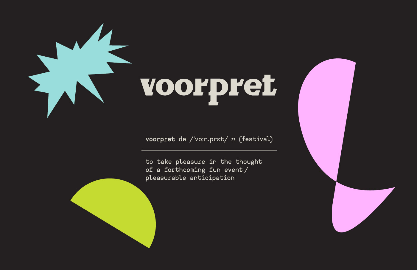
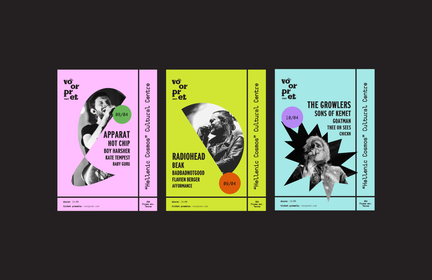
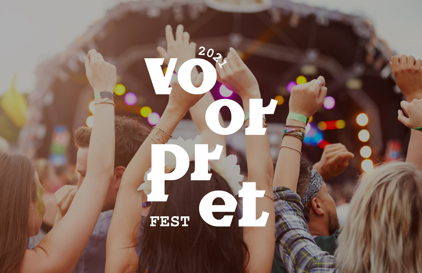
Voorpret, a Dutch word meaning the excitement one feels while anticipating a long-awaited event, is the name of this case study’s music festival. The project idea emerged after the cancellation of all live music concerts during the COVID-19 pandemic. As great music lovers, we felt an urge to design the image of our ideal music festival to have something to look forward to.
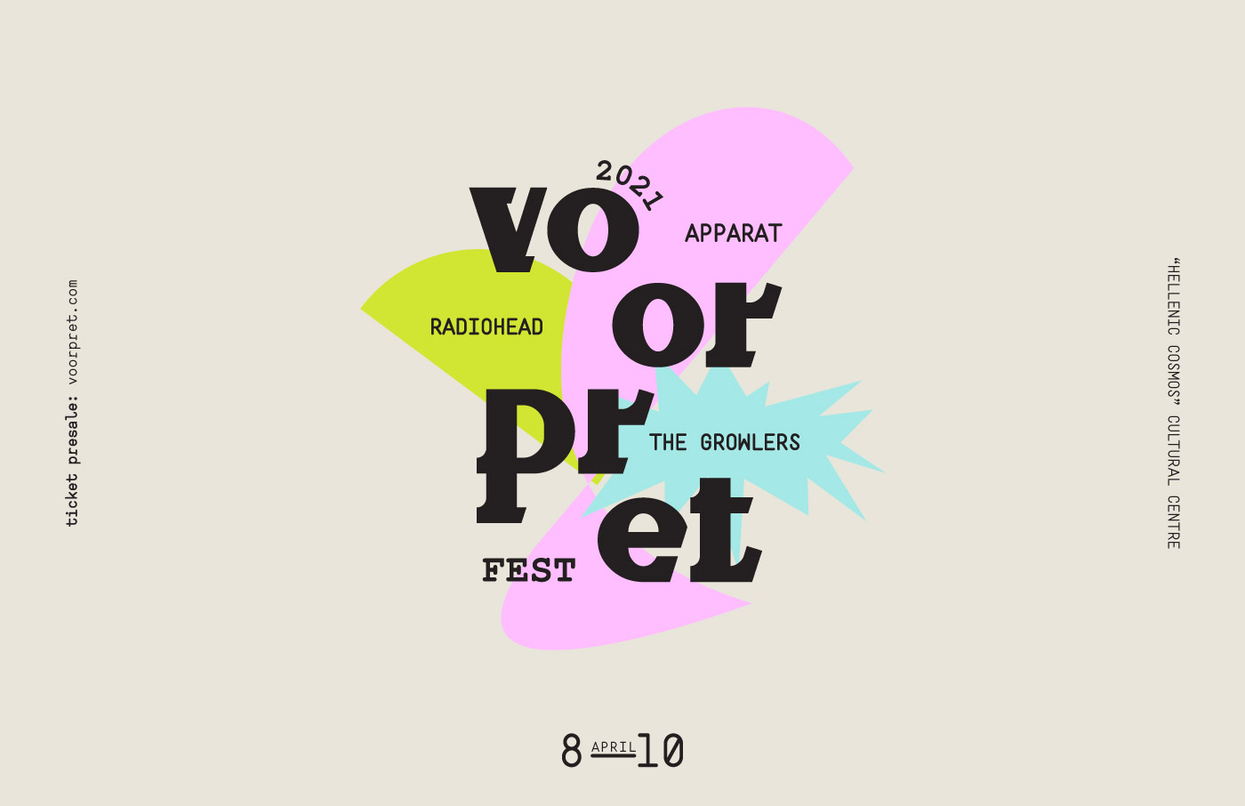
Initially, we envisioned ourselves as the creative studio approached by the event planning company to design the brand’s identity. This included all elements needed for promotional reasons and the well-tempered realization of Voorpret Music Festival. Therefore, we started by designing the logo as part of the branding.
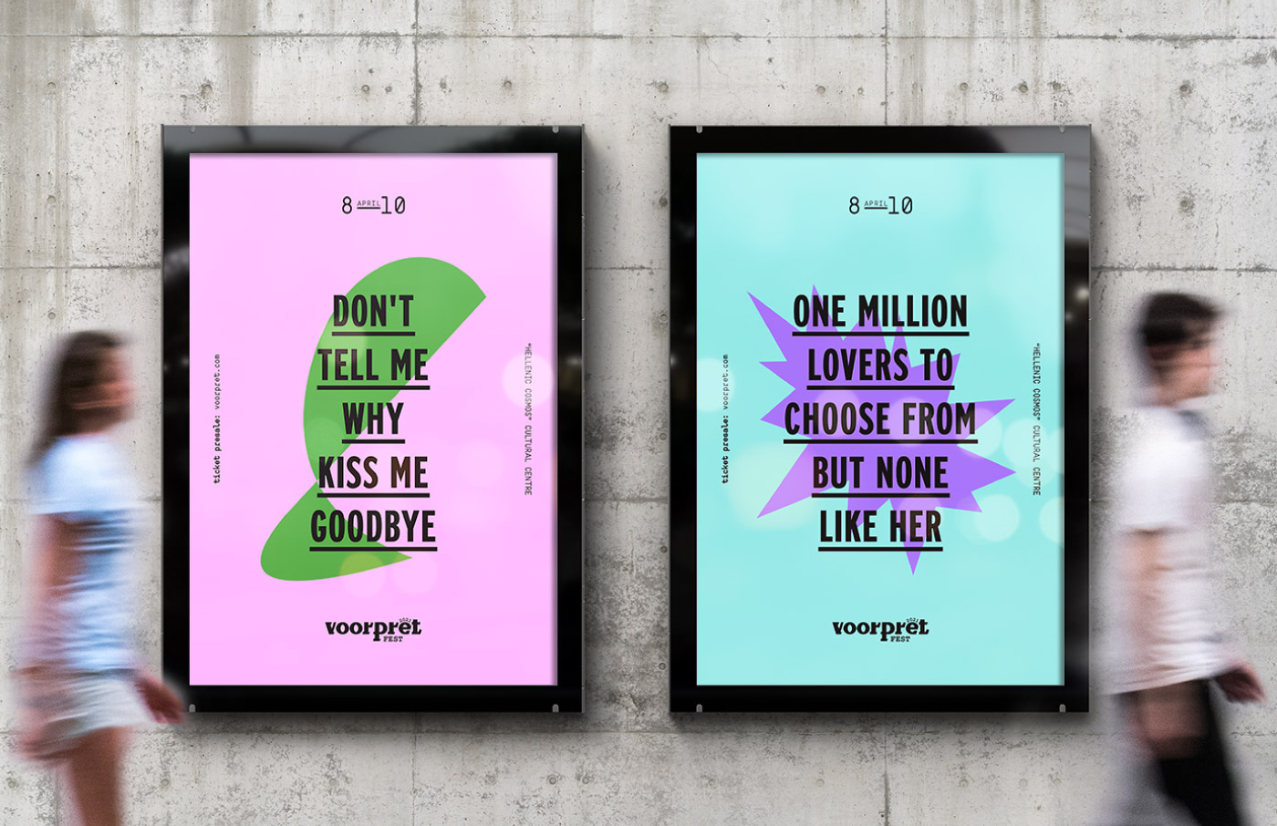
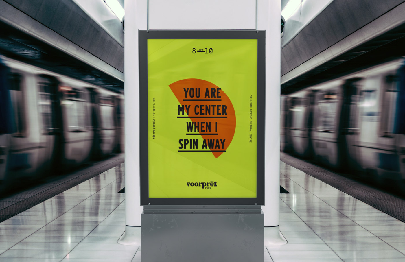
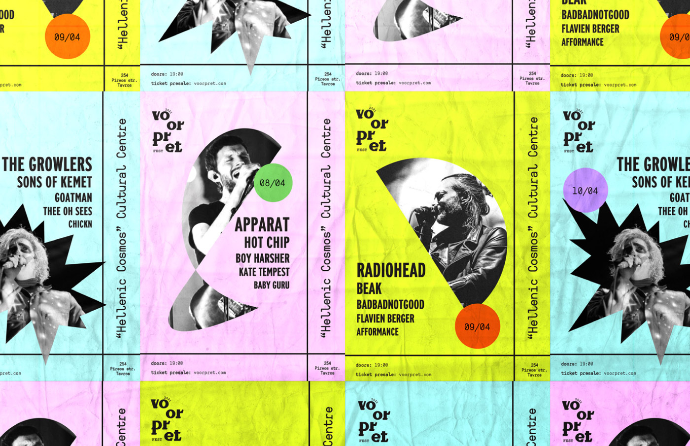
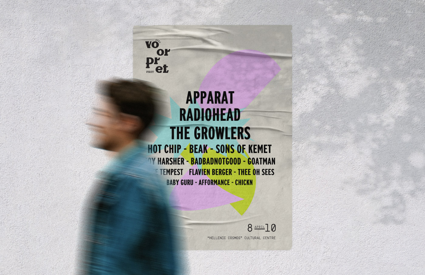
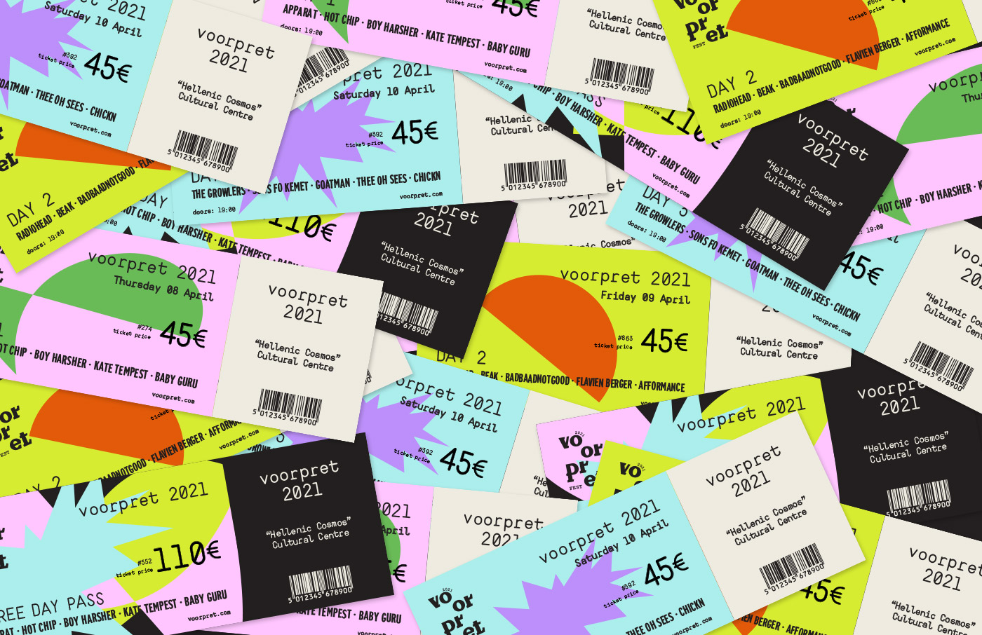
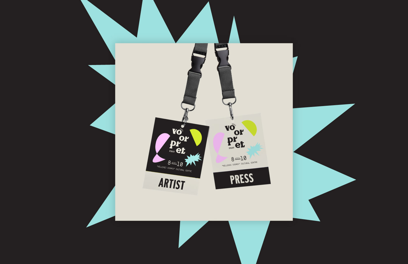
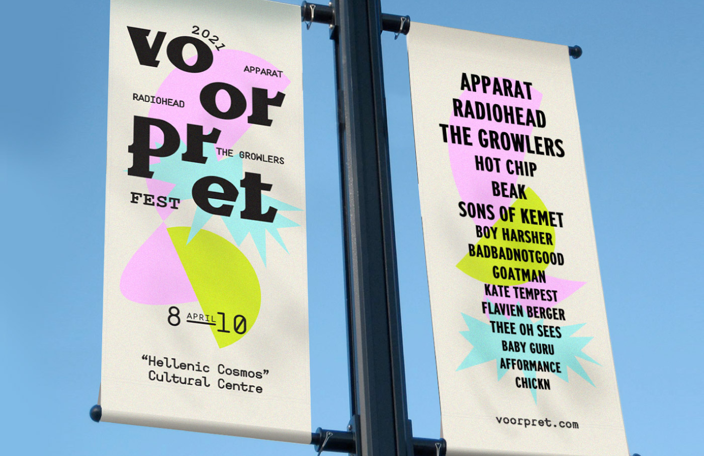
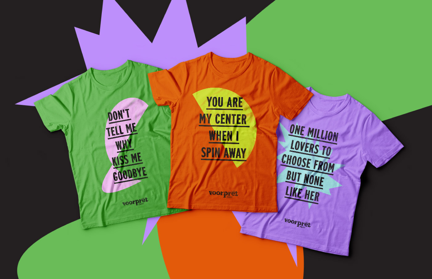
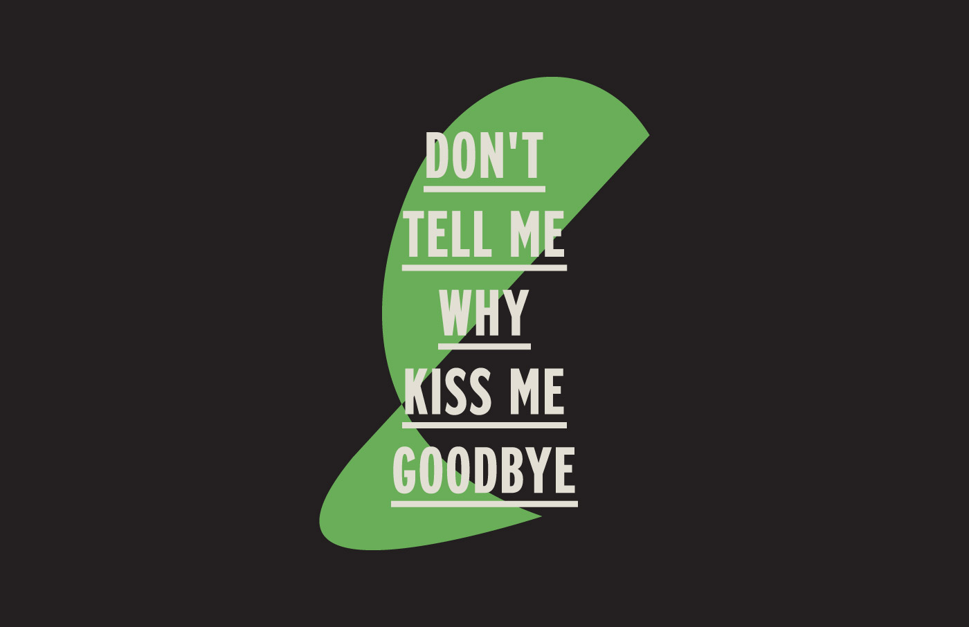
To further elaborate the visual identity, we focused on various elements such as posters, admission tickets, concert credential tags, banners, and merchandise. For instance, the teaser posters, released well in advance, reveal very little information, featuring only headliners’ lyrics to whet the audience’s appetite. Subsequently, posters released closer to the festival date include more details about the venue and lineup.
Moreover, we carefully selected graphic illustrations for the branding elements. The shapes convey the burst of enthusiasm and thrill during a concert, the energy of a dancing body, and the feeling of experiencing a group spectacle. Additionally, the bold color contrasts aim to catch attention and intensify suspense.
INSPIRATION CHANNEL
Music addiction
WE ACCEPT THE CHALLENGE
To get you through apocalypse with a musical survival kit
ALATI DESIGN(S) FOR
Live Music Industry
