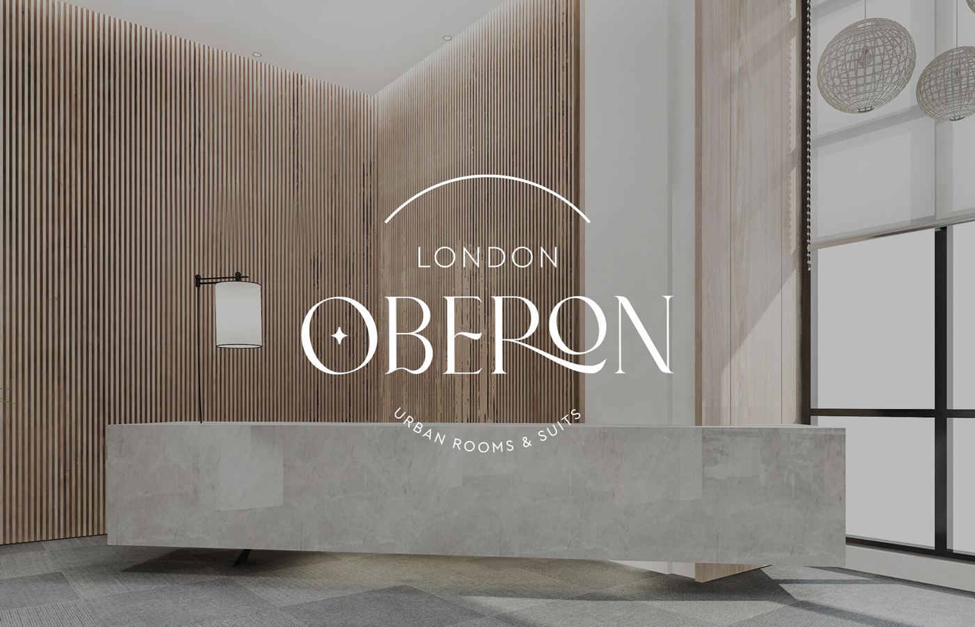
Oberon is a London-based hotel that provides luxurious accommodation. It offers nine rooms and six suites, designed to please every urban lover seeking a break from the city’s bustle. The hotel was constructed with a minimalist aesthetic. It incorporates 1960s architectural elements, giving the building a futuristic and powerful look. The owners, who are Shakespeare enthusiasts and amateur stargazers, named the hotel after Oberon. Oberon is both the king of the fairies in A Midsummer Night’s Dream and one of Uranus’s major moons.
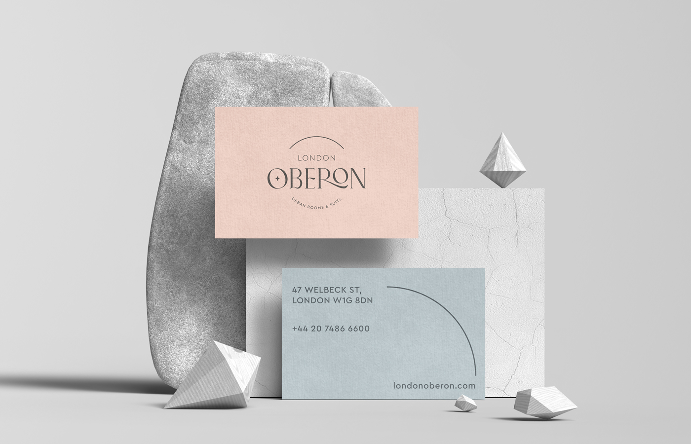
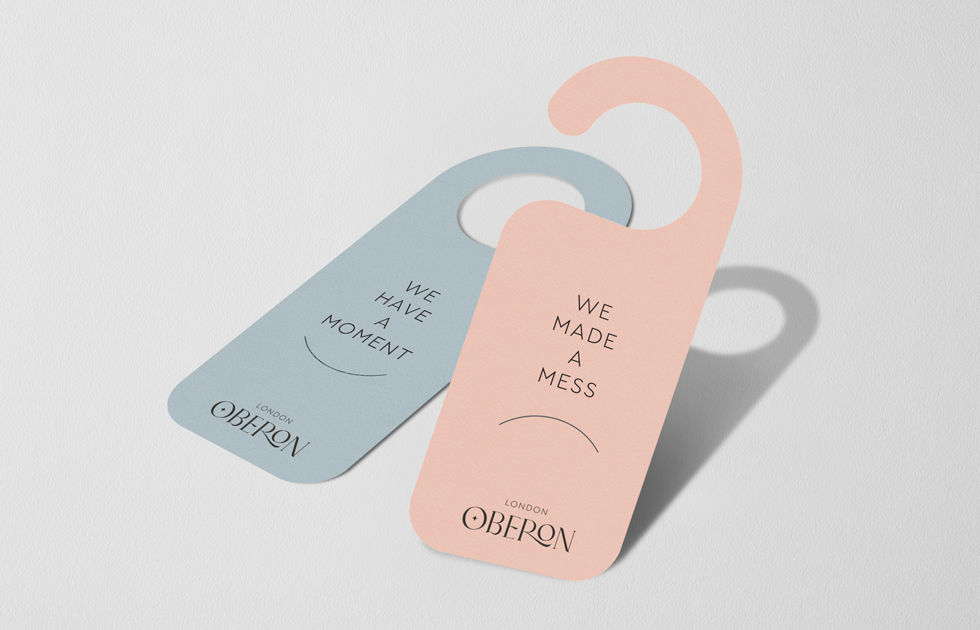
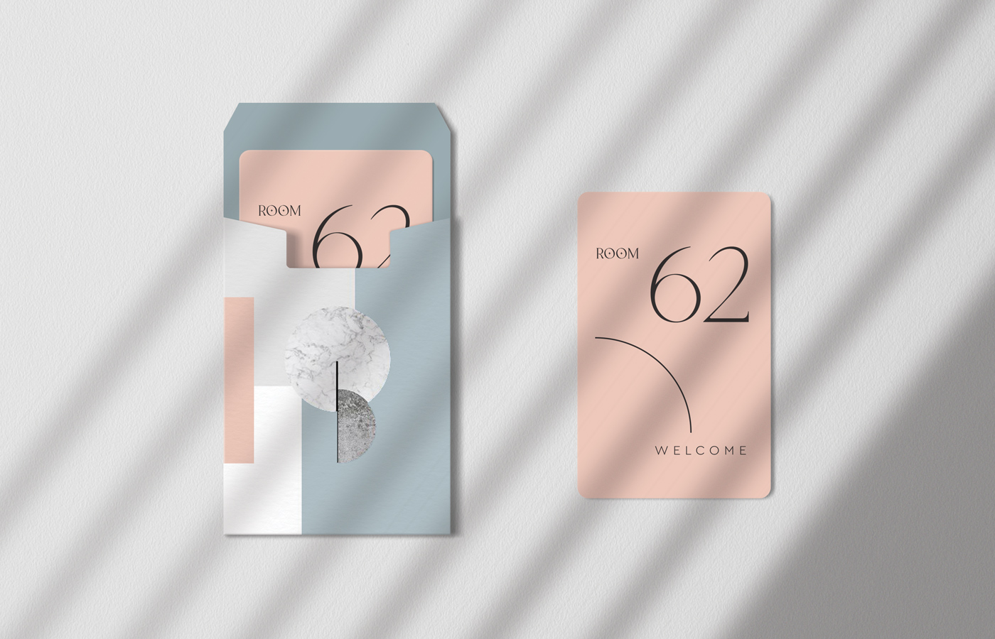
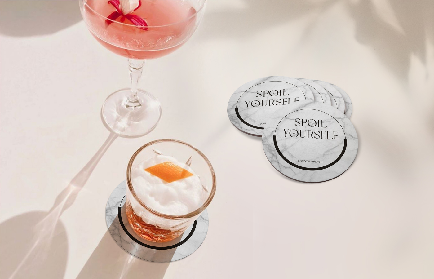
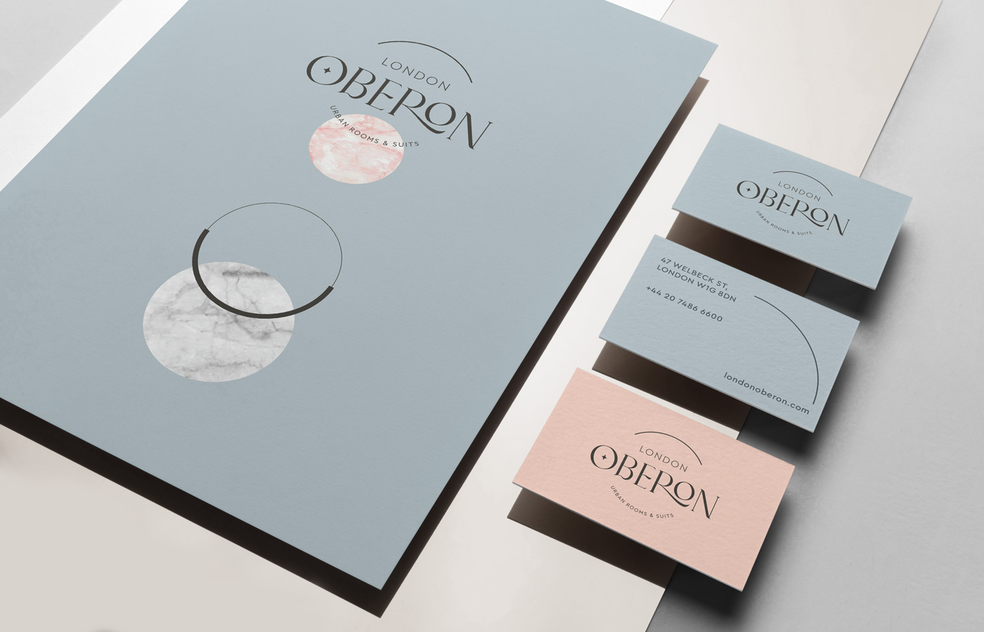
During the branding process, we stayed faithful to curves. This reflects the intimacy involved in such a project. Oberon’s curved orbit around Uranus resembles a tender cuddle, gentle and soft, luring one into a peaceful sleep. Due attention was given to the logo design, typography, and textures. The color palette of rusty pink and misty blue evokes the planets’ surface and the pastel shades of dawn and dusk. To build a cohesive visual identity, we designed several branding applications. These included business cards, stationery, door hangers, and hotel room key cards. We also designed hotel amenities like bathrobe and slipper embroidery.
INSPIRATION CHANNEL
Past and future fantasy worlds crashing reality
WE ACCEPT THE CHALLENGE
To create a strong identity for the sweetest dreams
ALATI DESIGN(S) FOR
Hospitality Industry